
Highly reusable React component boilerplate for your design system
Front-end engineers create dozens of components every week. Building just another web application is one thing, but when it comes to reusable components within a unified and sustainable design system, the situation changes drastically.
While working on a design system, I have experimented a lot, and came up with a quite promising component boilerplate for such occasion. Here it is.
...or
Generate common code (utils and types that can be re-used in all components):
npx @generilla/cli run https://github.com/gannochenko/react-component-boilerplate/tree/master/commons
Generate the component itself:
cd components && npx @generilla/cli run https://github.com/gannochenko/react-component-boilerplate/tree/master/component
- CSS-in-JS with Styled-components or Emotion for styling. It turns boring CSS into a fully-featured programming language based on JavaScript, so cool.
- React that supports hooks.
- TypeScript.
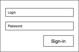
I took a boring sign-in as a today's challenge:
The starter code is a function component, according to the latest trends. I also refrain from using default exports, since named exports make in-IDE refactoring easier in the future:
import React, { FC } from 'react';export const SignInForm: FC = () => {return null;};
Many developers prefer keeping styles and type declarations next to the component itself. I usually don't do that, because the more complex the component gets, the more code I will have to co-locate in one file. Several-screens-tall file is difficult to maintain and comprehend.
That is why in my projects I propose the following file structure:
SignInForm/index.tsSignInForm.tsx <-- the component itself goes herestyles.tstypes.ts
Why index.ts file?
First of all, this kind of import will work:import { SignInForm } from './components/SignInForm'
Secondly, via index.ts file I can explicitly tell which part of the component I wish to expose to the end user:
export { SignInForm } from './SignInForm';export type { SignInFormPropType } from './types';// maybe something else ...
Every component has a scope of responsibility. It other words, a component is only responsible for what is inside of it, and completely unaware of its siblings or a parent node.
...import React, { forwardRef } from 'react';export const SignInForm = forwardRef(function SignInForm(props, ref) {// every component should have a root node// also,I am forwarding ref to the root nodereturn (<SignInFormRoot ref={ref}><SignInInput /><SignInInput type="password" /><SignInFormSubmitButton>Sign-in</SignInFormSubmitButton></SignInFormRoot>);});...
As you may have already noticed, I used type, not interface when declaring the typings. While interfaces have their advantages in some way,
I prefer going with types. This way the paradigm «prefer composition over inheritance» becomes easily feasible through union, unlike the OOP-ish inheritance via extends keyword.
I also
- use
Typepostfix for types to explicitly indicate the fact that this is not a variable, - have all props optional, because the component should gracefully handle situations when it was called without parameters.
It is also nice to have property naming agreements, for example like these ones:
- names of all callback props should begin with
onprefix (e.g.onSubmitButtonClick), - if a property is used as a feature flag, its name should begin with
enableprefix (likeenablePasswordLess), - names of all render props should start with
renderprefix (e.g.renderActionBar)
...and so on.
It may seem too much in the beginning, but when you build a long-lasting design system and wish to remain consistent, not following the rules quickly starts causing problems.
So, the props could be:
import { HTMLAttributes } from 'react';type ThemeType = {}; // replace this with your own theme typetype StylePropType = {theme: ThemeType;};export type SignInFormPropType =// first, take all native props for a desired type of DOM nodeHTMLAttributes<HTMLFormElement> &// then declare all custom props herePartial<{loading: boolean;onSubmit: (result: { login: string; password: string }) => void;enablePasswordLess: boolean;}>;export type SignInFormRootPropType = StylePropType & SignInFormPropType;export type SignInFormInputPropType = StylePropType;export type SignInFormSubmitButtonPropType = StylePropType;
Normally I develop components in greenhouse conditions somewhere in Storybook. But the thing is, real projects (especially legacy ones) provide a much more «hostile» environment, since there may be global CSS defined that could potentially distort appearance of the component drastically.
That is why I created a helper function to reset at least box-sizing and margin as well as maybe some of the inherited CSS properties.
import styled, { css } from 'styled-components';import {SignInFormRootPropType,SignInFormInputPropType,SignInFormSubmitButtonPropType,} from './types';export const getResetStyle = () => css`box-sizing: border-box;margin: 0;`;export const SignInFormRoot = styled.form<SignInFormRootPropType>`${getResetStyle};padding: 1rem;`;export const SignInInput = styled.input<SignInFormInputPropType>`${getResetStyle};border: 1px solid gray;border-radius: 2px;// ...`;export const SignInFormSubmitButton = styled.button<SignInFormSubmitButtonPropType>`${getResetStyle};border-radius: 2px;background-color: blue;color: white;// ...`;
Usually when it comes to conditional styling with styled-components, things turn into unreadable porridge of figure and square brackets very quickly. Nevertheless, I have tried to minimize the negative impact by moving everything to a separate helper:
...const getRootStyle = ({ loading, disabled }: SignInFormRootPropType) => {let result = {};if (loading) {result = css`${result};color: grey;// some other css`;}if (disabled) {result = css`${result};display: none;// some other css`;}// maybe some other propsreturn result;};export const SignInFormRoot = styled.form<SignInFormRootPropType>`${getResetStyle};padding: 1rem;${getRootStyle};`;...
When a custom property goes through a cabbage of wrappers and lands on the DOM node, React starts polluting the console with a bunch of annoying warnings like «Warning: React does not recognize the loading prop on a DOM element. Blah, blah...»
To prevent this, styled-components starting from v5 has a helper called shouldForwardProp.
Let's make a separate file called utils/propBlocker.ts:
import { ReactText } from 'react';// shouldForwardProp blocks everything that matches a set of standard HTML attributes plus children, ref and dangerouslySetHTML// in order to allow event handlers to be passed down to the react elements, we need to explicitly allow them against a white// list of known events:const allowedEventProps = {// Clipboard EventsonCopy: true,onCopyCapture: true,onCut: true,onCutCapture: true,onPaste: true,onPasteCapture: true,// Composition EventsonCompositionEnd: true,onCompositionEndCapture: true,onCompositionStart: true,onCompositionStartCapture: true,onCompositionUpdate: true,onCompositionUpdateCapture: true,// Focus EventsonFocus: true,onFocusCapture: true,onBlur: true,onBlurCapture: true,// Form EventsonChange: true,onChangeCapture: true,onBeforeInput: true, // https://developer.mozilla.org/en-US/docs/Web/API/HTMLElement/beforeinput_eventonBeforeInputCapture: true,onInput: true,onInputCapture: true,onReset: true,onResetCapture: true,onSubmit: true,onSubmitCapture: true,onInvalid: true,onInvalidCapture: true,// Image EventsonLoad: true,onLoadCapture: true,onError: true, // also a Media EventonErrorCapture: true, // also a Media Event// Keyboard EventsonKeyDown: true,onKeyDownCapture: true,onKeyPress: true,onKeyPressCapture: true,onKeyUp: true,onKeyUpCapture: true,// Media EventsonAbort: true,onAbortCapture: true,onCanPlay: true,onCanPlayCapture: true,onCanPlayThrough: true,onCanPlayThroughCapture: true,onDurationChange: true,onDurationChangeCapture: true,onEmptied: true,onEmptiedCapture: true,onEncrypted: true,onEncryptedCapture: true,onEnded: true,onEndedCapture: true,onLoadedData: true,onLoadedDataCapture: true,onLoadedMetadata: true,onLoadedMetadataCapture: true,onLoadStart: true,onLoadStartCapture: true,onPause: true,onPauseCapture: true,onPlay: true,onPlayCapture: true,onPlaying: true,onPlayingCapture: true,onProgress: true,onProgressCapture: true,onRateChange: true,onRateChangeCapture: true,onSeeked: true,onSeekedCapture: true,onSeeking: true,onSeekingCapture: true,onStalled: true,onStalledCapture: true,onSuspend: true,onSuspendCapture: true,onTimeUpdate: true,onTimeUpdateCapture: true,onVolumeChange: true,onVolumeChangeCapture: true,onWaiting: true,onWaitingCapture: true,// MouseEventsonAuxClick: true, // https://developer.mozilla.org/en-US/docs/Web/API/Element/auxclick_eventonAuxClickCapture: true,onClick: true,onClickCapture: true,onContextMenu: true,onContextMenuCapture: true,onDoubleClick: true,onDoubleClickCapture: true,onDrag: true,onDragCapture: true,onDragEnd: true,onDragEndCapture: true,onDragEnter: true,onDragEnterCapture: true,onDragExit: true,onDragExitCapture: true,onDragLeave: true,onDragLeaveCapture: true,onDragOver: true,onDragOverCapture: true,onDragStart: true,onDragStartCapture: true,onDrop: true,onDropCapture: true,onMouseDown: true,onMouseDownCapture: true,onMouseEnter: true,onMouseLeave: true,onMouseMove: true,onMouseMoveCapture: true,onMouseOut: true,onMouseOutCapture: true,onMouseOver: true,onMouseOverCapture: true,onMouseUp: true,onMouseUpCapture: true,// // Selection EventsonSelect: true,onSelectCapture: true,// yep, it is a long one...// Touch EventsonTouchCancel: true,onTouchCancelCapture: true,onTouchEnd: true,onTouchEndCapture: true,onTouchMove: true,onTouchMoveCapture: true,onTouchStart: true,onTouchStartCapture: true,// Pointer EventsonPointerDown: true,onPointerDownCapture: true,onPointerMove: true,onPointerMoveCapture: true,onPointerUp: true,onPointerUpCapture: true,onPointerCancel: true,onPointerCancelCapture: true,onPointerEnter: true,onPointerEnterCapture: true,onPointerLeave: true,onPointerLeaveCapture: true,onPointerOver: true,onPointerOverCapture: true,onPointerOut: true,onPointerOutCapture: true,onGotPointerCapture: true,onGotPointerCaptureCapture: true,onLostPointerCapture: true,onLostPointerCaptureCapture: true,// UI EventsonScroll: true,onScrollCapture: true,// Wheel EventsonWheel: true,onWheelCapture: true,// Animation EventsonAnimationStart: true,onAnimationStartCapture: true,onAnimationEnd: true,onAnimationEndCapture: true,onAnimationIteration: true,onAnimationIterationCapture: true,// Transition EventsonTransitionEnd: true,onTransitionEndCapture: true,};// finally...export const propsBlocker = {shouldForwardProp: (propertyName: ReactText | boolean,validateProperty: (propertyName: any) => boolean) => {if (typeof propertyName === 'string' && propertyName in allowedEventProps) {return true;}// https://github.com/emotion-js/emotion/blob/main/packages/is-prop-valid/src/props.jsreturn validateProperty(propertyName);},};
And then I use it like this:
// ...import { propsBlocker } from '../../../utils/propBlocker';export const SignInFormRoot = styled.div.withConfig(propsBlocker)<SignInFormRootPropType>`${getResetStyle};padding: 1rem;${getRootStyle};`;// ...
This guarantees no custom property is going to leak through the logic to the underlying react element.
Now comes the cool part!
Back in early days the controller and the view (UI) of a component were sort of fused together within a class component. Some tried to abuse inheritance, others came up with that «concept of smart and dumb components». None of it really worked out well. With react hooks it became really easy to decouple the code.
I am gonna put all the logic into a hook useSignInForm located in a separate file.
UI stays pretty clean and easily perceivable by just quick glancing at.
Before doing so, I am gonna make an auxiliary hook to handle references in hooks/useRootRef.ts:
import { useRef, ForwardedRef, RefObject } from 'react';export const useRootRef = <E extends HTMLElement>(ref: ForwardedRef<E>) => {const localRef = useRef<E>(null);// we only allow modern reference syntaxreturn (ref as RefObject<E>) || localRef;};
The result of the main hook is a structure that contains props forwarded to the UI elements.
import { Ref, useCallback, ForwardedRef } from 'react';import { SignInFormPropType } from './types';import { useRootRef } from '../../../hooks/useRootRef';export const useSignInForm = <E extends HTMLDivElement>(ref: ForwardedRef<E>,{loading,onSubmit,enablePasswordLess,...restProps}: SignInFormPropType) => {// put all your logic here: call some useMemo, useEffect or useCallback, or any other custom hook// ...// you can use an externally set ref, as well as the local oneconst rootRef = useRootRef<E>(ref);// now you can do different cool things with rootRef, because// it will always be defined after the very first render// for example,const onSubmitClick = useCallback(() => {onSubmit({ login, password }); // take from local state updated by callbacks for inputs}, [onSubmit, login, password]);return {rootProps: {...restProps, // rest props go to the root node, as beforeref: rootRef, // same for the ref},loginInputProps: {disabled: loading,onChange: onLoginInputChange, // defined somewhere above},getPasswordInputProps: () => { // I use a getter here, because the password field is optionaltype: 'password',disabled: loading,onChange: onPasswordInputChange, // defined somewhere above},submitButtonProps: {onClick: onSubmitClick,disabled: loading,},showPasswordInput: !enablePasswordLess,};};
Then I consume the hook in SignInForm.tsx:
...import { useSignInForm } from './hooks/useSignInForm.ts';export const SignInForm = forwardRef<HTMLDivElement, SignInFormPropType>(function SignInForm(props, ref) {const {rootProps,loginInputProps,getPasswordInputProps,submitButtonProps,showPasswordInput} = useSignInForm<HTMLDivElement>(ref, props);return (<SignInFormRoot {...rootProps}><SignInInput {...loginInputProps} />{showPasswordInput&&<SignInInput {...getPasswordInputProps()} />}<SignInFormSubmitButton {...submitButtonProps}>Sign-in</SignInFormSubmitButton></SignInFormRoot>);});
There should be a way to customise not only the root node, but also all inner nodes.
One of the options could be to define class names to address the nodes via styled.
The format of a class name could be different, I personally prefer BEM (e.g. SignInForm-Input--disabled).
So first of all, I define a custom hook:
import { useMemo } from 'react';const makeClassName = (blockName: string,elementName = 'Root',modifier?: string) => `${blockName}-${elementName}${modifier ? `--${modifier}` : ''}`;export const useSignInFormClassNames = (componentName: string,className: string) =>useMemo(() => ({Root: `${className} ${makeClassName(componentName)}`,LoginInput: makeClassName(componentName, 'LoginInput'),PasswordInput: makeClassName(componentName, 'PasswordInput'),SubmitButton: makeClassName(componentName, 'SubmitButton'),}),[componentName, className]);
Then I consume the hook right next to the first one:
import { useSignInFormClassNames } from './hooks/useSignInFormClassNames';export const SignInForm = forwardRef<HTMLDivElement, SignInFormPropType>(function SignInForm(props, ref) {const {rootProps,loginInputProps,passwordInputProps,submitButtonProps,showPasswordInput} = useSignInForm<HTMLDivElement>(ref, props);const classNames = useSignInFormClassNames('SignInForm', className);return (<SignInFormRoot{...rootProps}className={classNames.Root}><SignInInput{...loginInputProps}className={classNames.LoginInput}/>{showPasswordInput&&<SignInInput{...passwordInputProps}className={classNames.PasswordInput}/>}<SignInFormSubmitButton{...submitButtonProps}className={classNames.SubmitButton}>Sign-in</SignInFormSubmitButton></SignInFormRoot>);});
If this is done, the customization works like this:
const CustomSignInForm = styled(SignInForm)`color: red;.SignInForm-Input {border-radius: 4px;}.SignInForm-SubmitButton {color: white;}`;
In general I would not go with this too far. Atomic props introduce additional computation, sometimes unnecessary.
Nevertheless, sometimes it make sense to have at least margin, padding, width, height defined as atomic.
Margin props could look somewhat like this:
import { css } from 'styled-components';export type ScalarType = string | number;export type MarginPropType = Partial<{margin: ScalarType;marginTop: ScalarType;marginBottom: ScalarType;marginLeft: ScalarType;marginRight: ScalarType;}>;const getValue = (value?: ScalarType) => {if (typeof value === 'string') {return value;}// in case of number, can do something fun here,// like converting spacing unit to pixels, or pixels to remreturn value;};const getStyleFor = (property: string, value?: ScalarType) =>value !== undefined ? `${property}: ${getValue(value)};` : '';export const getMarginStyle = ({margin,marginTop,marginBottom,marginLeft,marginRight,}: MarginPropType) => css`${getStyleFor('margin', margin)}${getStyleFor('margin-top', marginTop)}${getStyleFor('margin-bottom', marginBottom)}${getStyleFor('margin-left', marginLeft)}${getStyleFor('margin-right', marginRight)}`;
Then plug the mixin into the component.
To the styles:
import { getMarginStyle } from '../../utils/getMarginStyle';export const SignInFormRoot = styled.div.withConfig({shouldForwardProp: (prop) => !(prop in customProps),})<SignInFormRootPropType>`${getResetStyle};padding: 1rem;${getRootStyle};${getMarginStyle}; // <-- injected here`;
To the types:
import { MarginPropType } from '../style/getMarginStyle';export type SignInFormPropType =HTMLAttributes<HTMLFormElement> &Partial<{loading: boolean;onSubmit: ({ login: string; password: string; }) => void;enablePasswordLess: boolean;}> &MarginPropType; // <-- injected here
When this is done, the atomic props become available:
<SignInForm marginTop="10px" marginLeft="2rem" />
Sometimes when building a reusable component written in TypeScript, it is easy to forget, that a component can be used in a project written in plain JavaScript.
PropTypes can be a big deal of help in this case, acting as a drop-in replacement for TS types. Also, PropTypes do runtime prop validation, whereas TS types only do static code analysis (which is sufficient in most of the cases though).
Default props is a nice addition when you want to have some props set to something else than undefined.
...SignInForm.defaultProps = {onSubmit: () => {}};
That is pretty much it for this boilerplate! Certainly, not all of the features are needed when it comes to making actual components IRL. But, it is still nice to have all of these features in one place. Every time we build a component or a set of components which should be consistent, we can easily take this code as a starter!
If you still have any questions left, or something does not work, feel free to react out to me and discuss the issue.
